Frozen Proposal
A complete redesign of a high-stakes financial flow, restructuring information architecture, simplifying the UI and applying strategic motion to respect users' decision-making time.
Context
Prendários is Mercado Libre's vehicle-financing product. The frozen proposal is the moment a customer's approved offer is locked and presented for final review — a high-stakes, time-sensitive financial decision. The experience starts with a push notification and guides users through every contracting step of their vehicle financing.
The problem
The original flow suffered from heavy information overload, low predictability, and required fast decisions in a complex financial context. This led to confusion, longer comprehension time, and lower completion rates.
Process & decisions
Restructuring the flow before touching the UI
I mapped the original journey and rebuilt its information architecture around how users actually decide: fewer competing messages per screen, predictable steps, and a pace that respects the weight of a financing decision.
Designing the emotional peak with color science
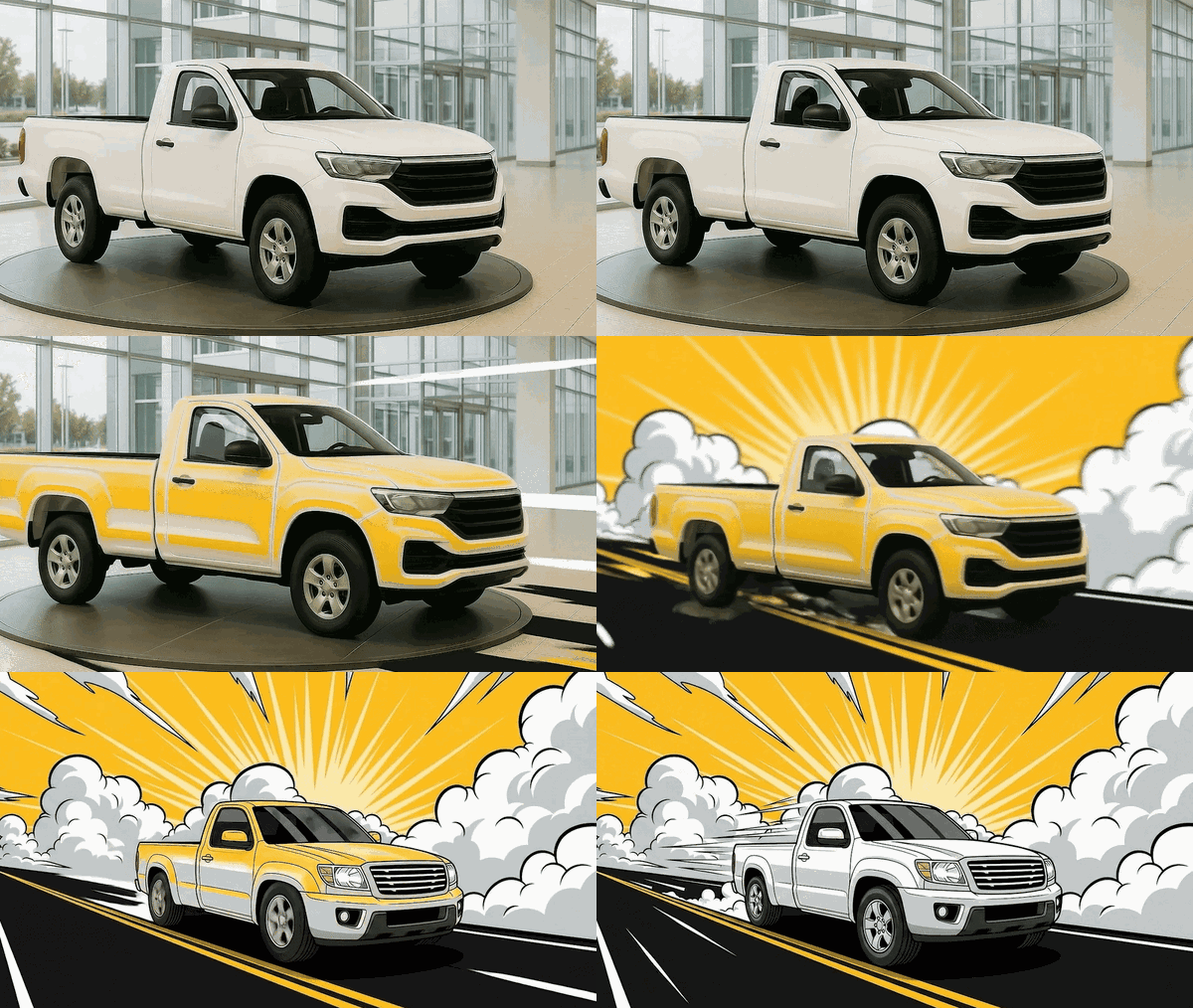
For the approval moment I researched the psychology of sunset light — golden hour, sun at the horizon, and twilight — mapping the biological and psychological response to each phase. Golden-hour warmth (comfort, closeness, reward) set the art direction for the celebration screen: the user driving toward the light in their new car.


Prototyping motion end to end
Motion was specified as part of the product, not decoration: it guides reading order, hierarchy and pacing. The full flow was delivered as an interactive prototype — from the first push notification to the final celebration — so engineering could feel the intended rhythm before building it.
The solution
I led the complete redesign of the experience, restructuring the information architecture, simplifying the UI, and applying strategic motion with art direction and emotional design. Motion guides reading, hierarchy, and pacing, reducing noise and increasing trust at every step.
Demo
The full prototype: push notification → contracting steps → car photo → signature → celebration.
Results
By combining a well-structured architecture, simplified interface, and purposeful motion, the design dramatically reduces cognitive load and improves decision-making.
Screens
Loan consigned at Neon Bank